


The context
“Cardedeu Informatiu” is the flagship news program on Ràdio Televisió Cardedeu, Spain's first local TV station and the world's first station in Catalan. Since its 1981 debut, this program has delivered town news on a weekly basis, thanks to the dedicated volunteers collaborating altruistically at the station.
The challenge
As the current graphic package from 2017 started to feel outdated, I decided to imagine what a possible rebrand would look like. The new branding had to be minimalist, with a digital touch due to its young crew and spirit, and easily adaptable to all kinds of applications, while maintaining a spark of personality and keeping it linked to RTVC's unique traits.
The approach
Given this briefing, I opted to merge the contemporary and digital aspect with the project's historical background. A distinguishable branding next to the rest of La Xarxa TV's newscasts; a graphic package both visually appealing and cohesive, and simple to be carried out by the reduced volunteer staff; and a modern and dynamic pace to the broadcast, to maintain the spectators' attention at all times.
The “_”
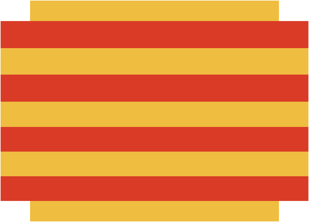
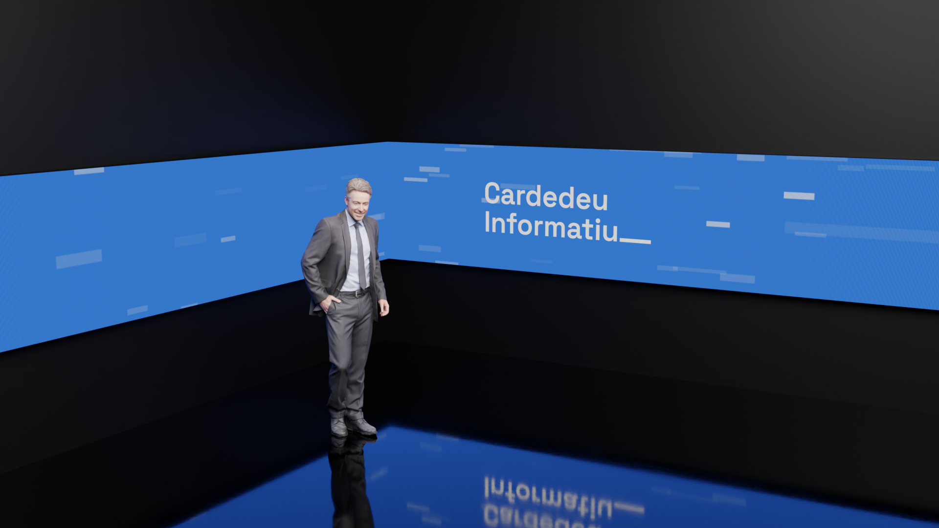
A symbol normally seen in the background becomes the protagonist of the whole visual identity. The underscore or bar is the representation of both the historic and modern sides of the project. When stretched, the bar conceptually becomes a timeline, standing as the representation of the first newscast broadcast of a local station, but also serving as a bar on top of which the graphic package's elements are built. Moreover, this underscore is also used throughout the project as any social network user would, separator, distinctive sign, and more, making reference to the young side of the station.
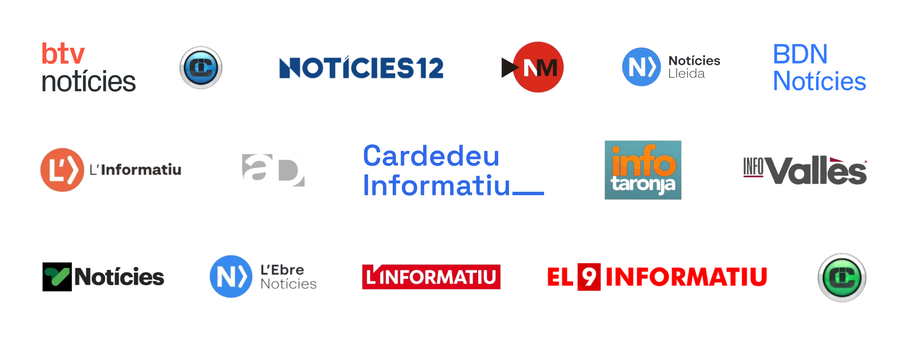
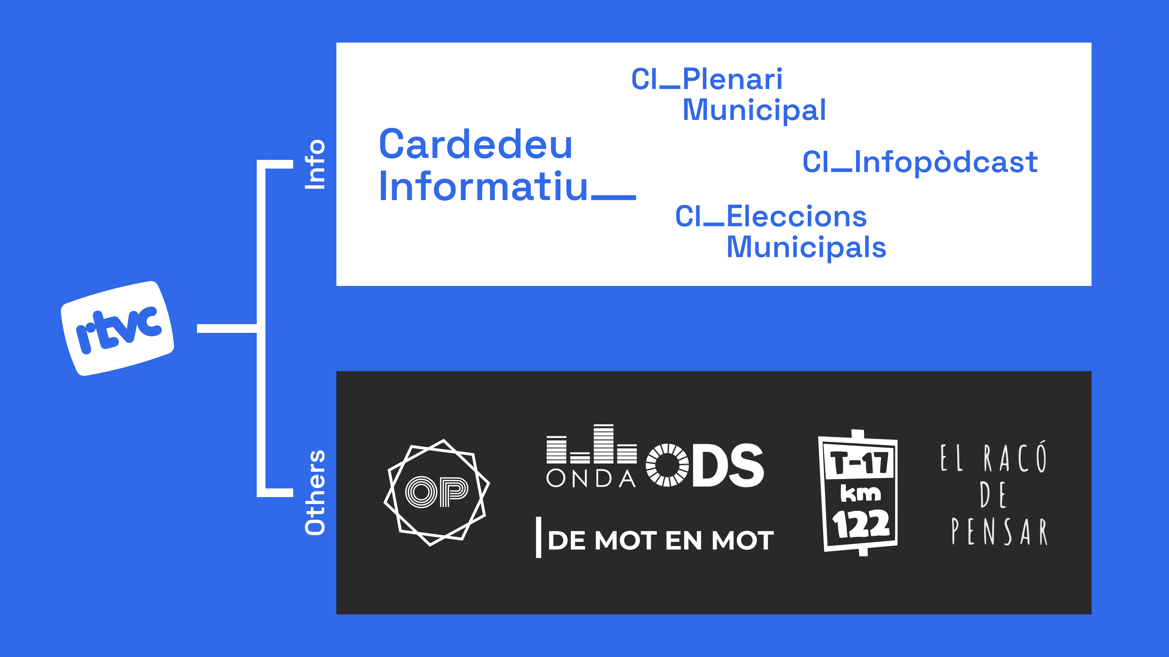
Brand Architecture: Information Services
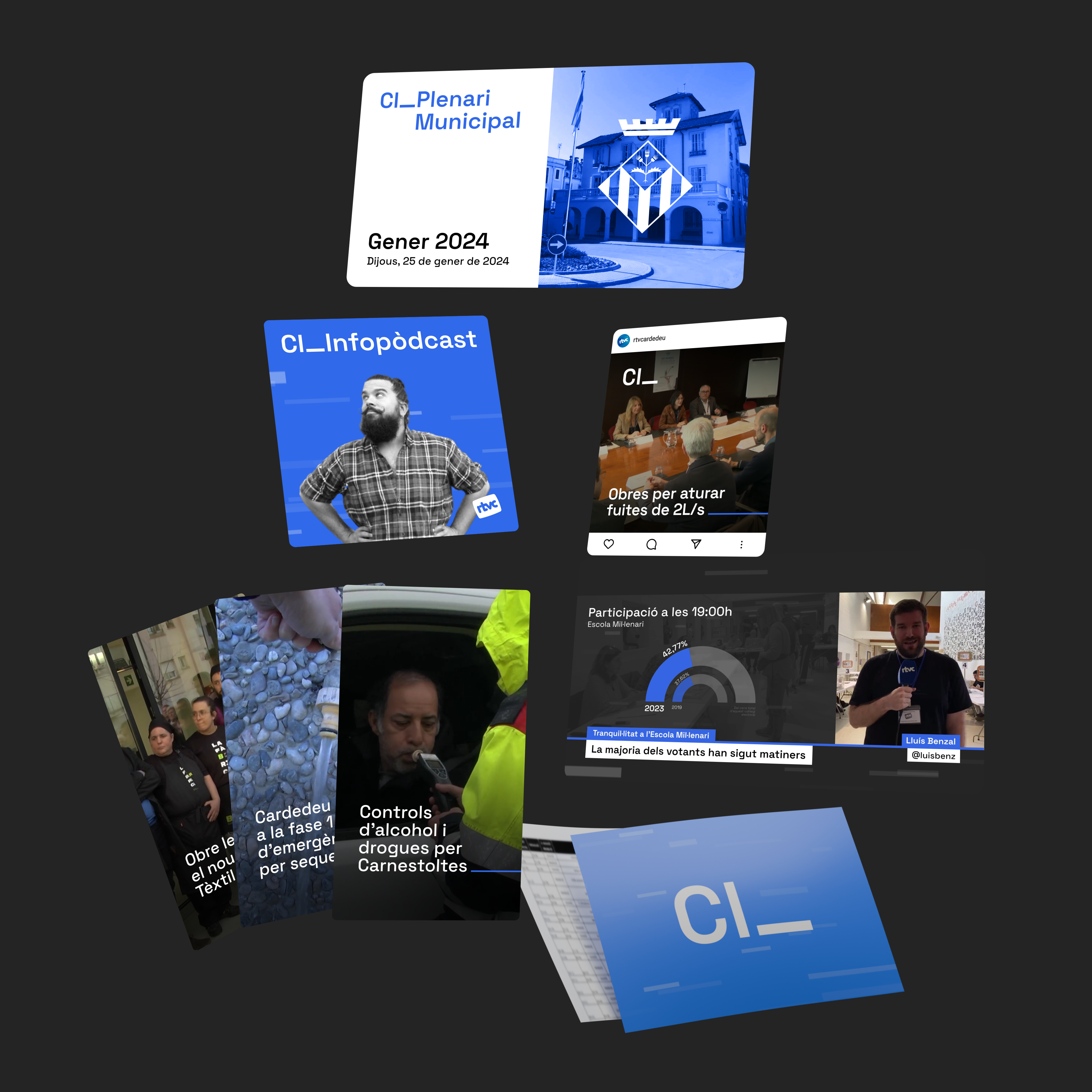
Taking advantage of the fact that the branding for the main newscast was so versatile, I decided to renew the brand architecture of all the info-related programs that RTVC produces to be under the new "Cardedeu Informatiu" brand. With this change, all the formats can make use of the same graphic package, making the production a simpler task while giving the viewer a cohesive identity of all types of programs, easier to recognize and associate with RTVC.
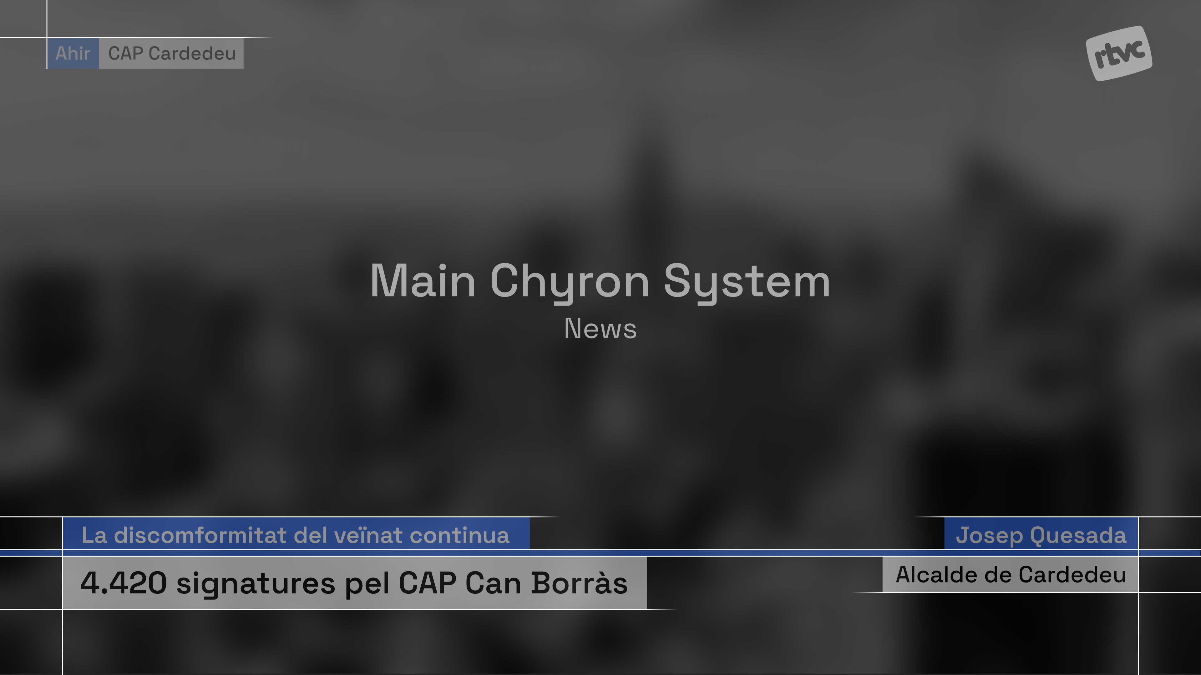
Main Chyron System
The main chyron system had to be a simple and versatile one, capable of showing multiple types of information easily and at the same time. The primary element is the project's bar that stretches through the whole width of the screen, and acts as the centerpiece on top of which the majority of components appear. There is also a separate element on the top-left of the canvas, that can be adapted to all kinds of uses (date and location, hashtag, ticker, and more). This modular approach enables the team to create and adapt all kinds of graphics and information to be shown directly on the lower thirds without the need of starting from scratch.
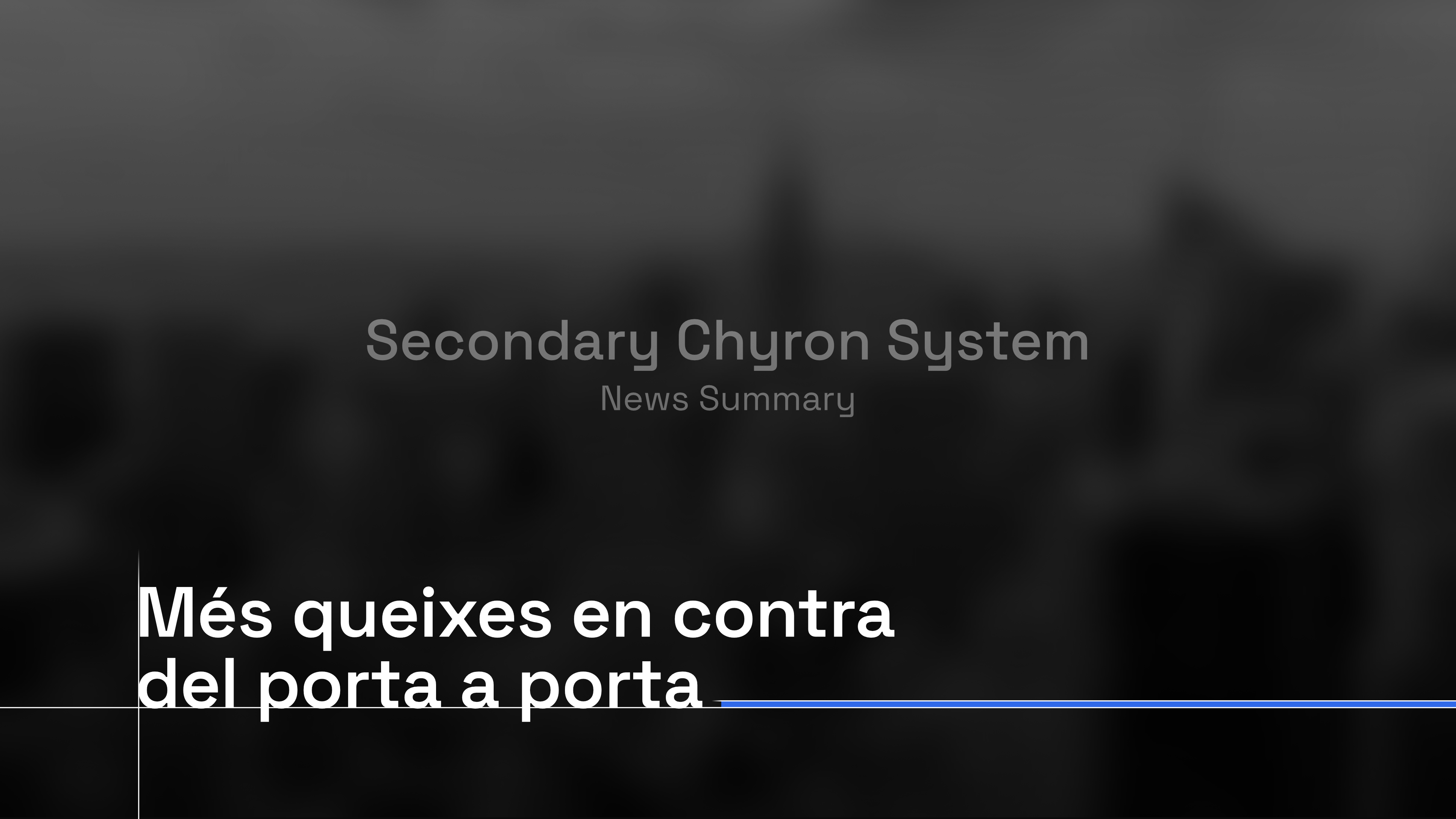
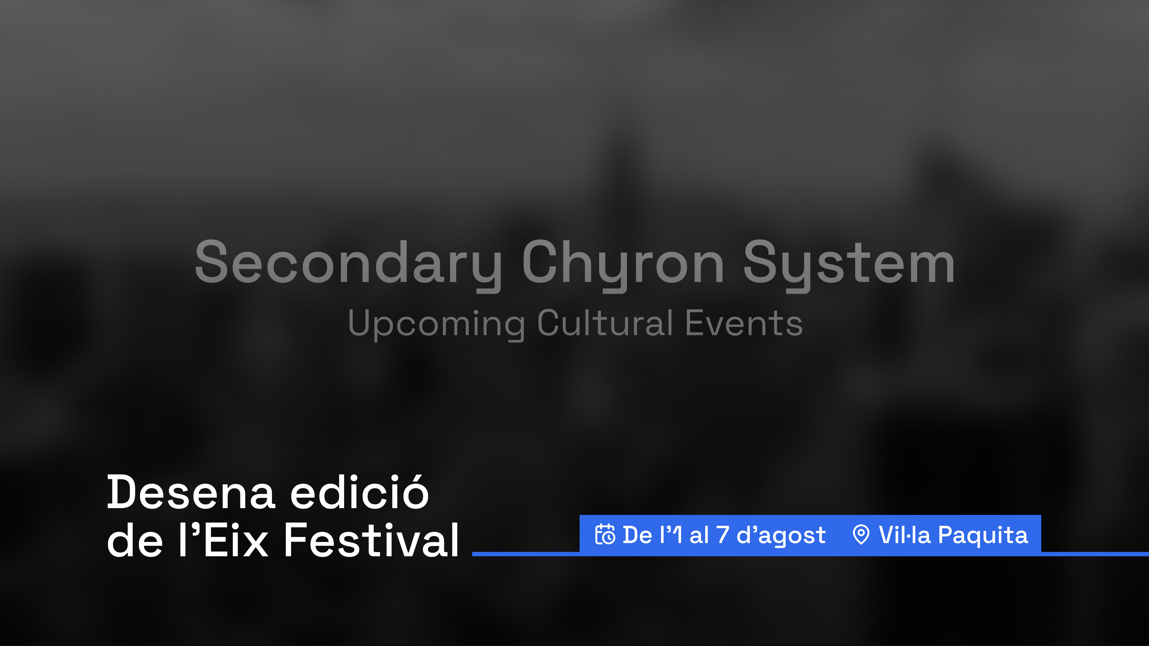
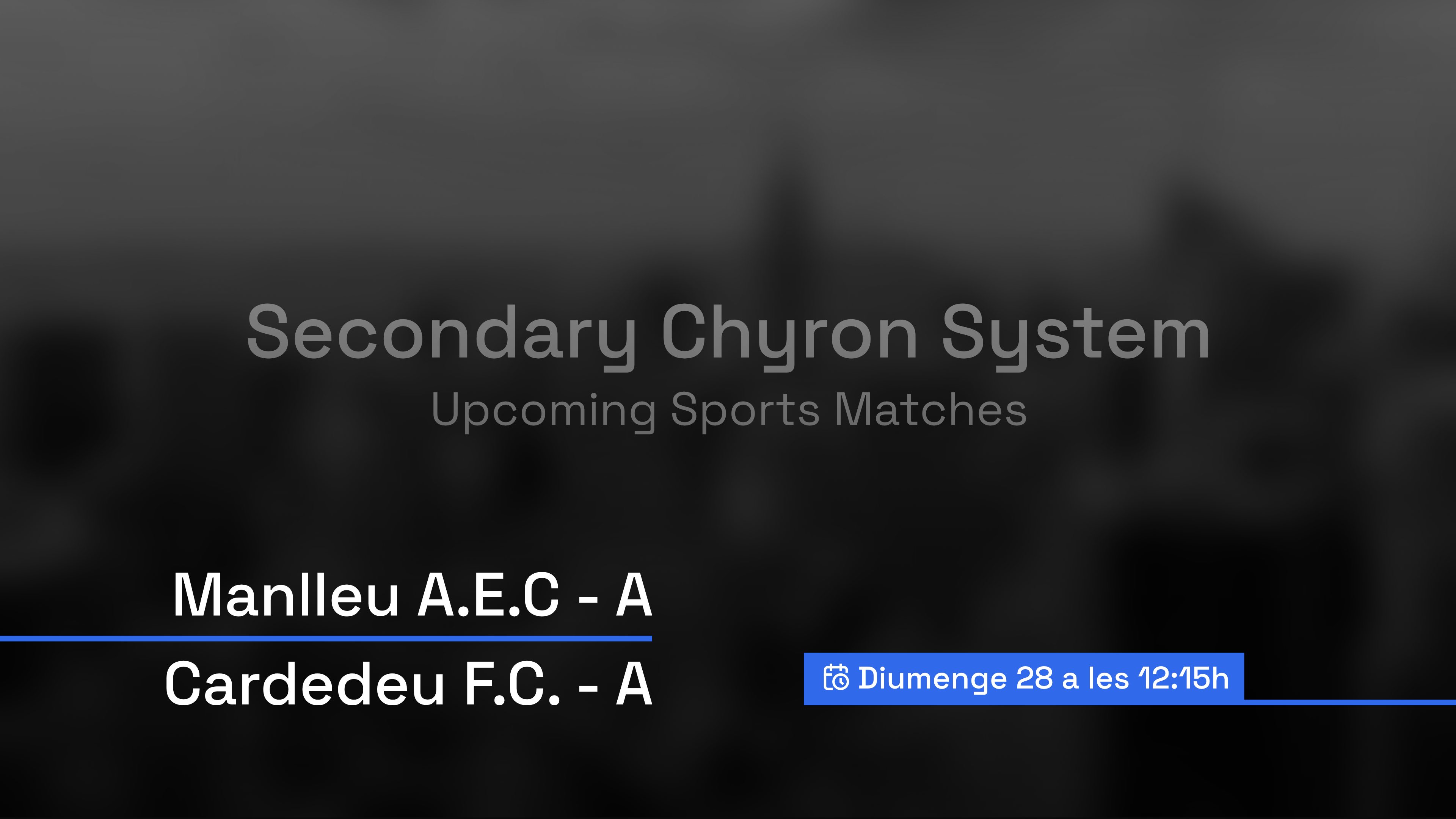
Secondary Chyron System
The secondary system is used in exclusive contexts and for very specific needs, such as the headlines, or the cultural and sports agenda. These chyrons vary slightly depending on the use, but all of them feature a relatively big text, with a line that goes from the text ending to the right edge of the screen. This allows the viewer to know what is being talked about at a glance, without having to focus on some regular-sized text, such as in the main system. In the cultural and sports agenda contexts, extra info is added in boxes with icons that, on top of saving useful space, are more visually appealing than a label explaining the content.
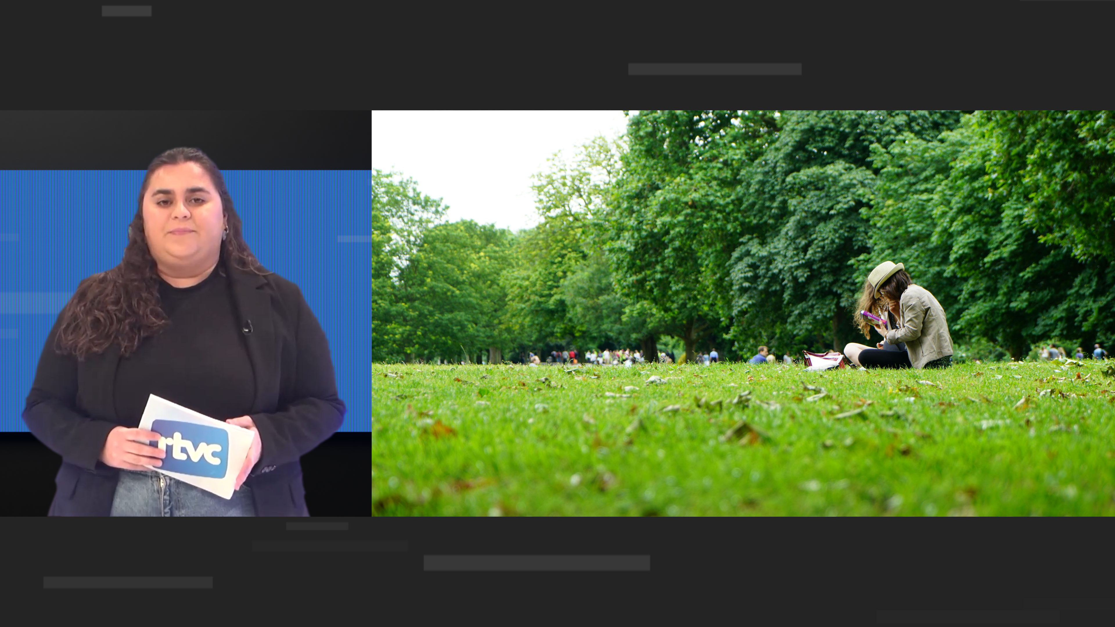
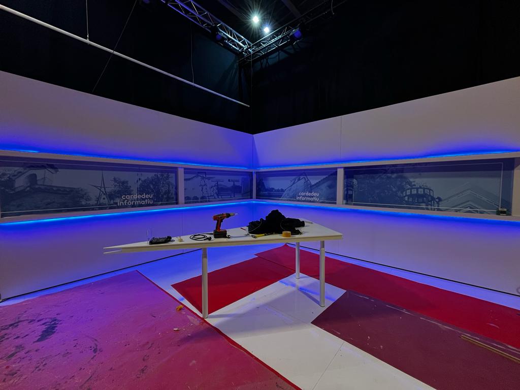
TV Set
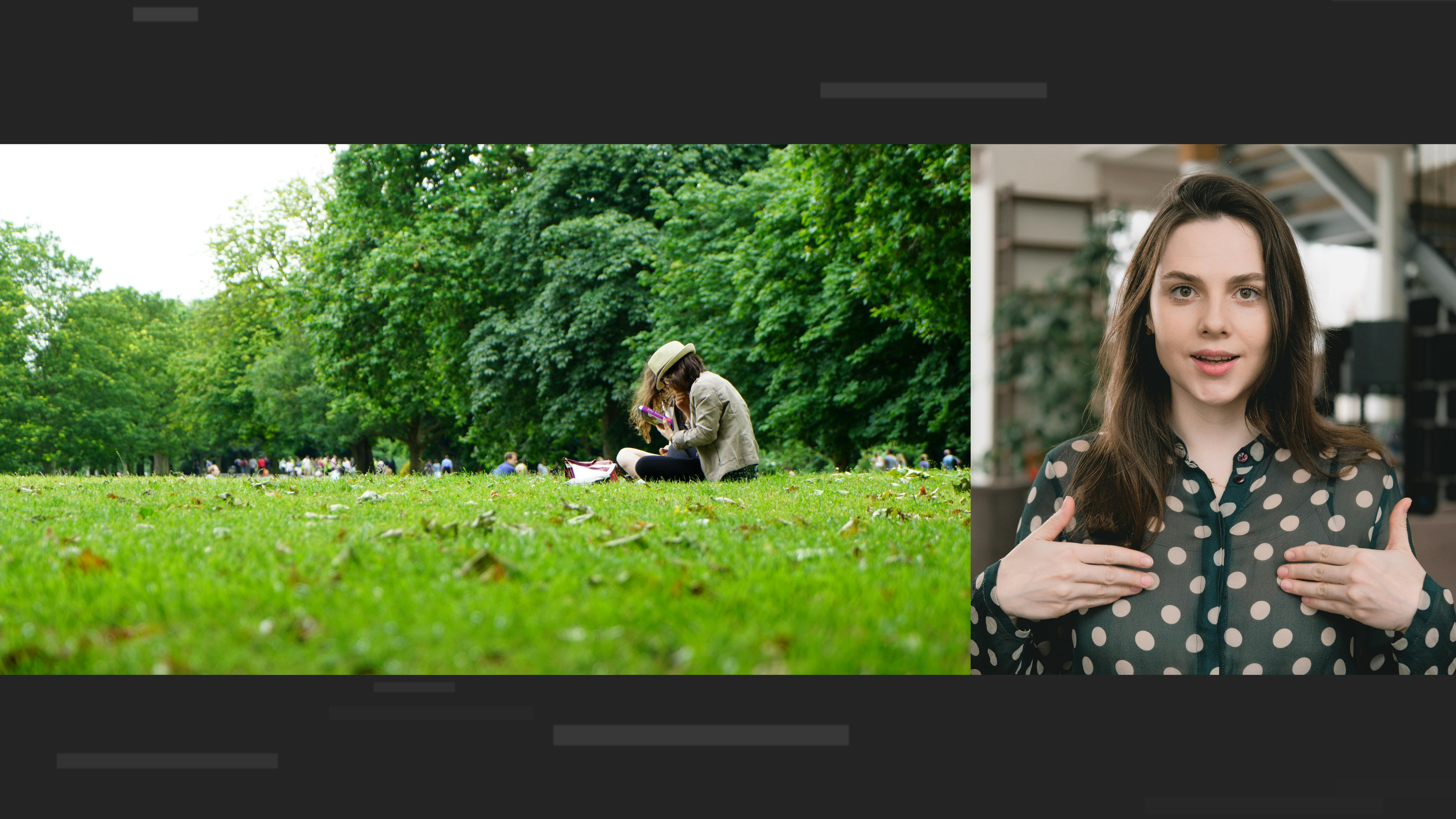
Starting from the real set RTVC built for its new Cardedeu Informatiu, I created an alternative version to better fit the project's personality. The studio is completely black and minimalist, to focus the attention of the viewer to what really matters, while giving a professional image. The only remarkable item in the set is the long videowall that goes around the set's perimeter. A narrow decorative screen that distances from the immense ones seen nowadays on Spanish television, making the program unique as well as adjusting to RTVC's tight budget. Despite the primary purpose of this videowall being for aesthetics, it can also be utilized to display valuable graphics and information that better explains the narrative of the news presented by each program.
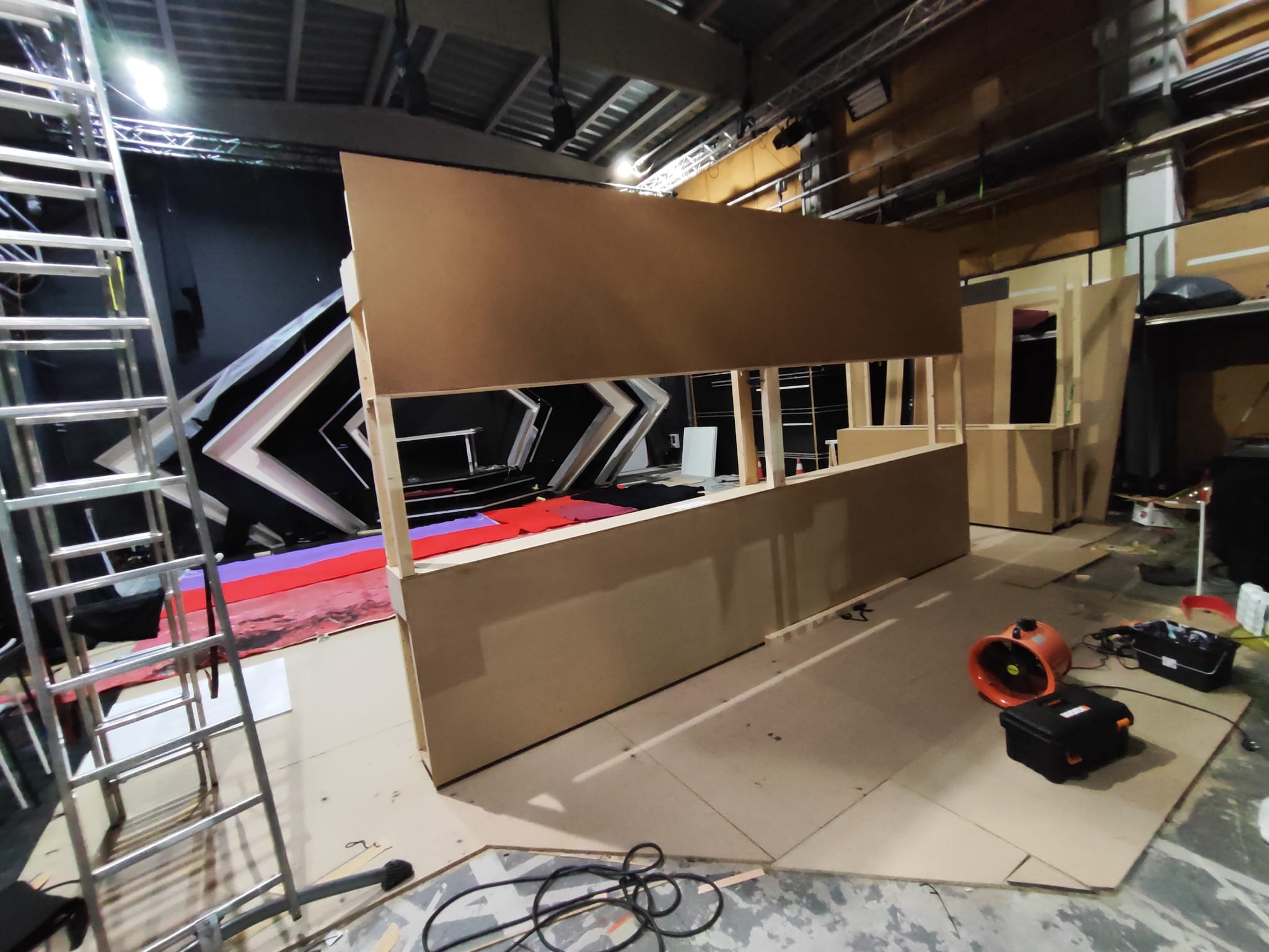
Original set process (by RTVC)
The minimalism of the set and the all-black materials give the environment the elegant and formal tone a newscast requires, while the videowall adds the spark of color and dynamism. This also enables the studio to be extremely versatile, as it can be adapted to any kind of informative and non-informative type of broadcasts, something to keep in mind due to RTVC's characteristics.
Though the videowall is meant to be primarily a decorative element, it's certain that it can be used as a tool to make the programs more lively and easier to comprehend. All kinds of graphic elements such as charts, data, context pictures or connections with reporters can make use of the screen to enhance the viewer's experience.
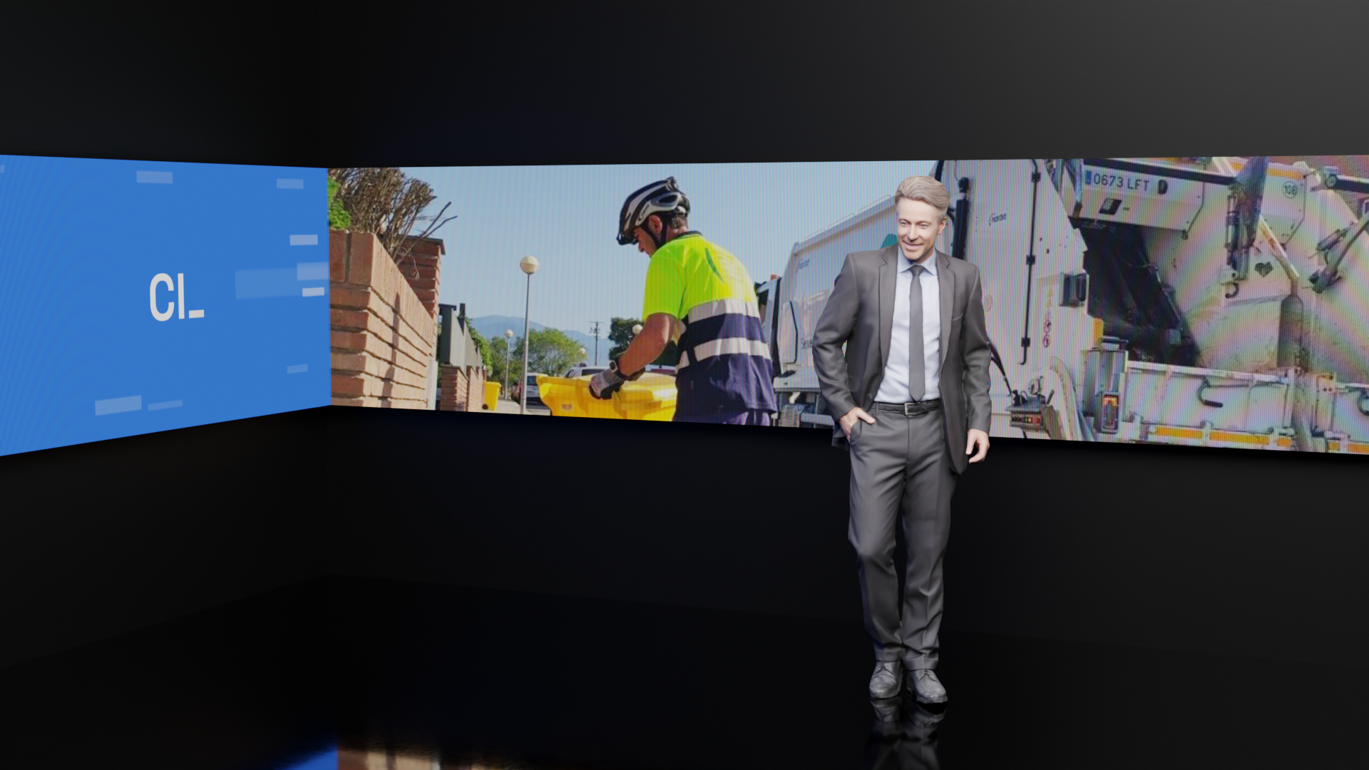
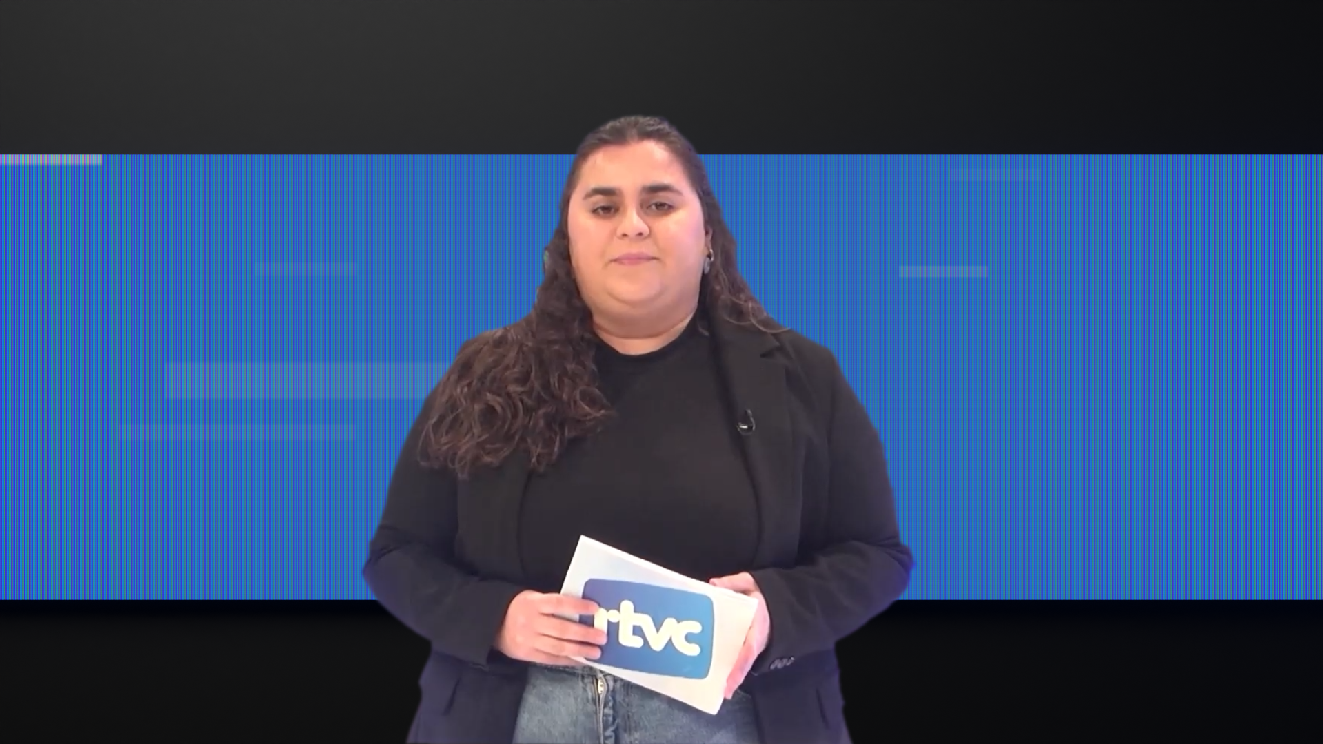
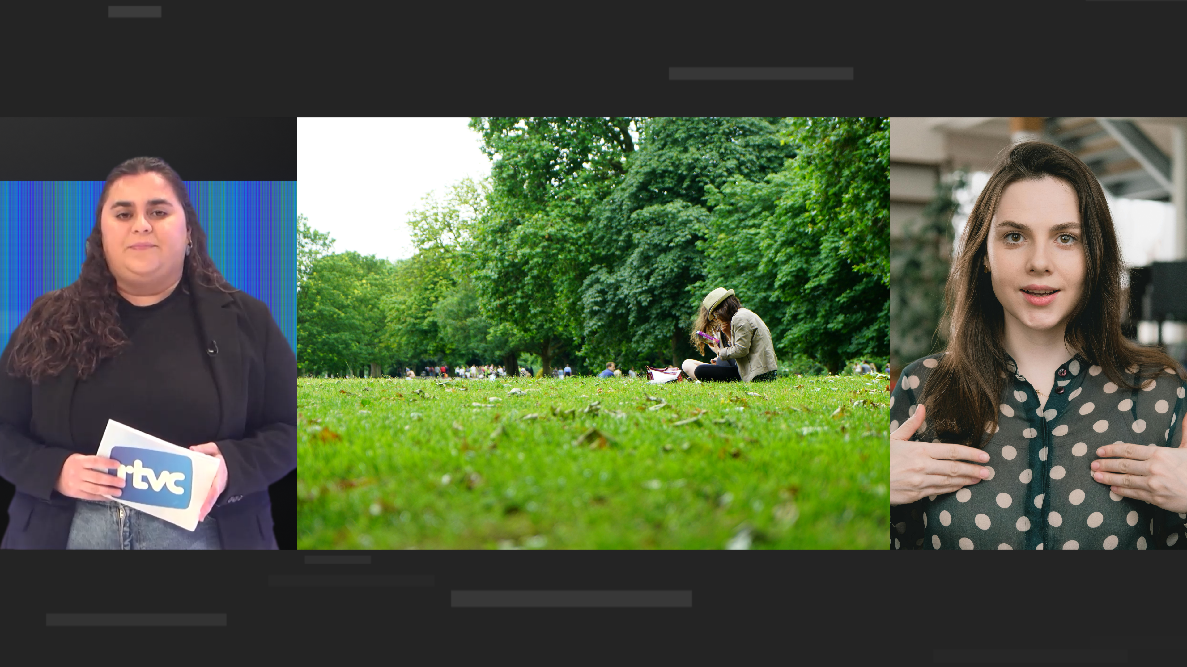
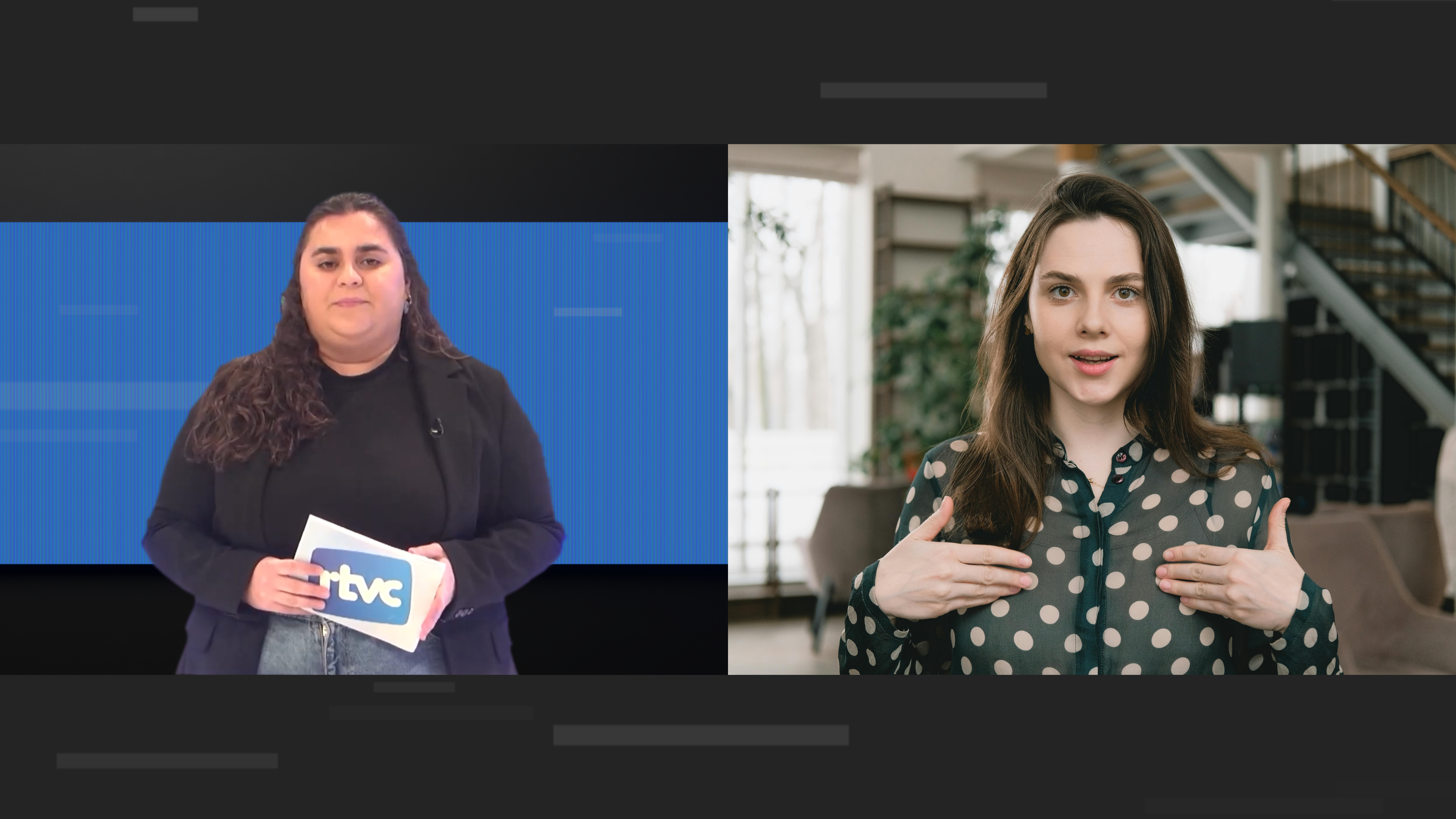
Fictional renders with real presenters
Cardedeu Informatiu set in construction pictures provided by: Guerau Camí
Special thanks: Alejandro González
"Cardedeu Informatiu" programs and "Especial Eleccions Municipals 2023" © 2022-2024 by Ràdio Televisió Cardedeu are licensed under CC BY 4.0
Hexagone 1, Hexagone 2, Hexagone 6, Hexagone 96, Hexagone 97, Hexagone 124 by Jean-Michel Jarre: © France Télévisions
Branding, Graphic package, Reel, Mock program: © 2024 alex malvehy
This is a personal project created for demonstration purposes only and is not affiliated nor endorsed by RTVC.
The use of this or similar artwork is strictly prohibited without the explicit and written approval of the copyright holder.